← Back to work
CMF Strategy · Industrial Design · 2024
HelloKlean
Redesigned a plumbing component into a skincare ritual object.
Redesigned a plumbing component into a skincare ritual object.
The question I kept returning to was simple: what does a woman who spends £80 on a face serum think when she looks at everything attached to her shower? Not just the filter. The showerhead. The rain shower. Everything.
If the answer is "plumbing fixture," the brand has already failed — before she's even turned on the water.
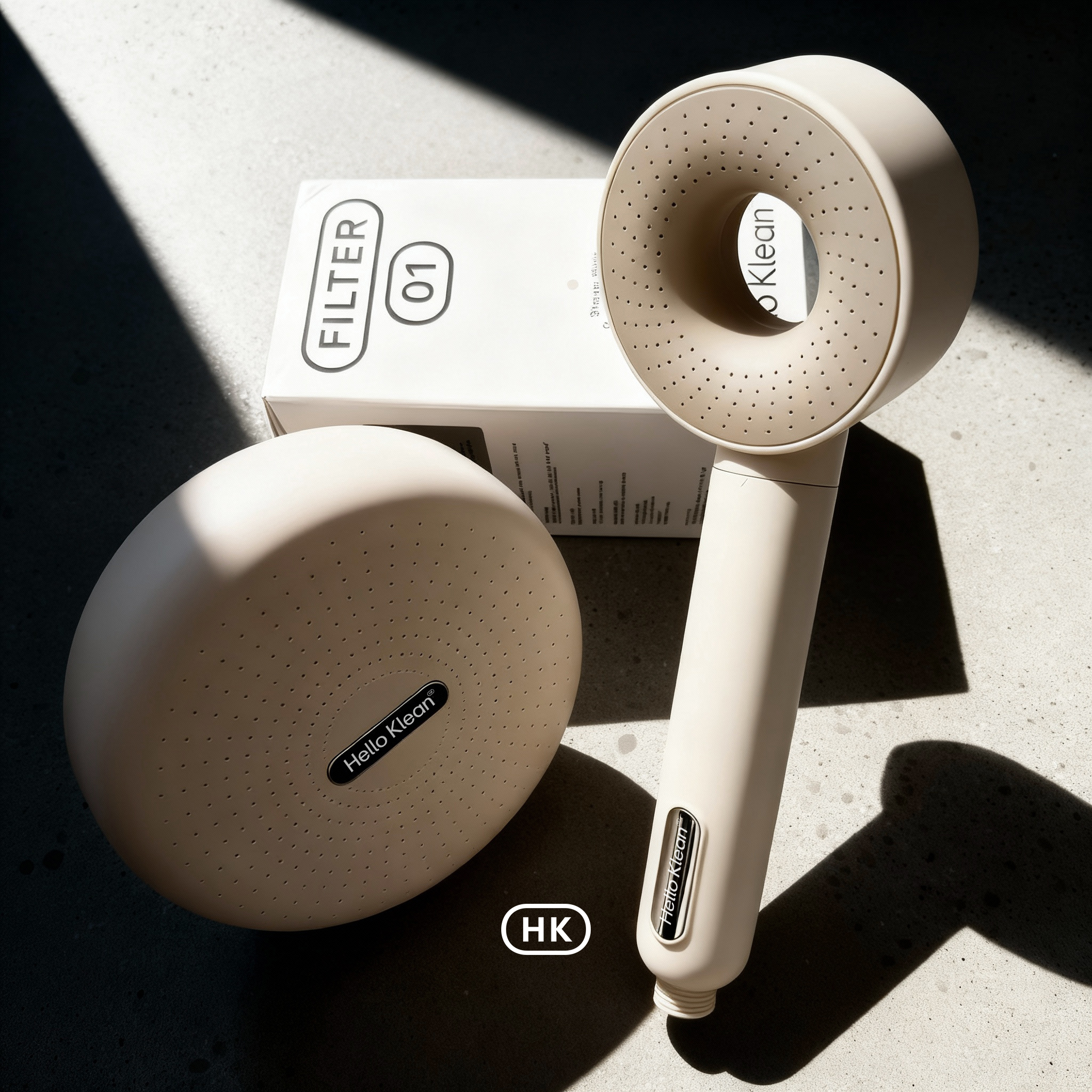
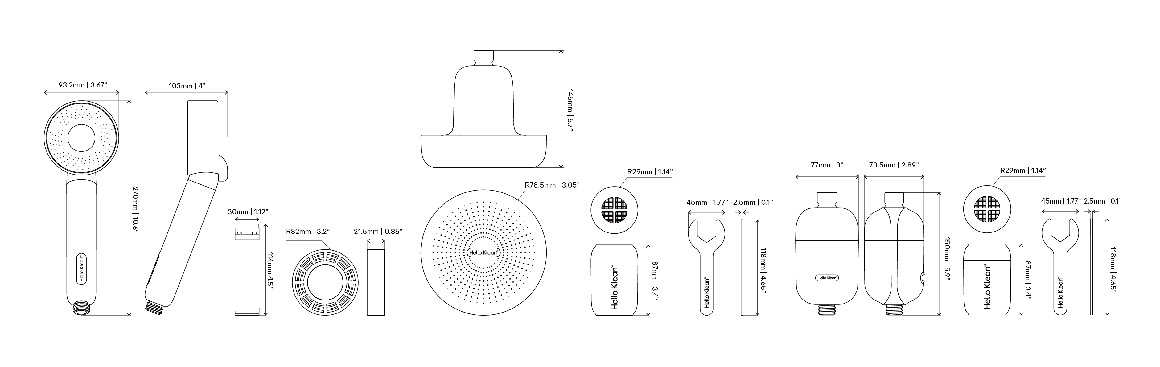
HelloKlean's brief grew from there. What started as a single filter became a full system: filter capsule, showerhead, and rain shower. Three products. One design language. One answer to that question.
The HelloKlean system — filter capsule, showerhead, and rain shower. One design language across three touch points.
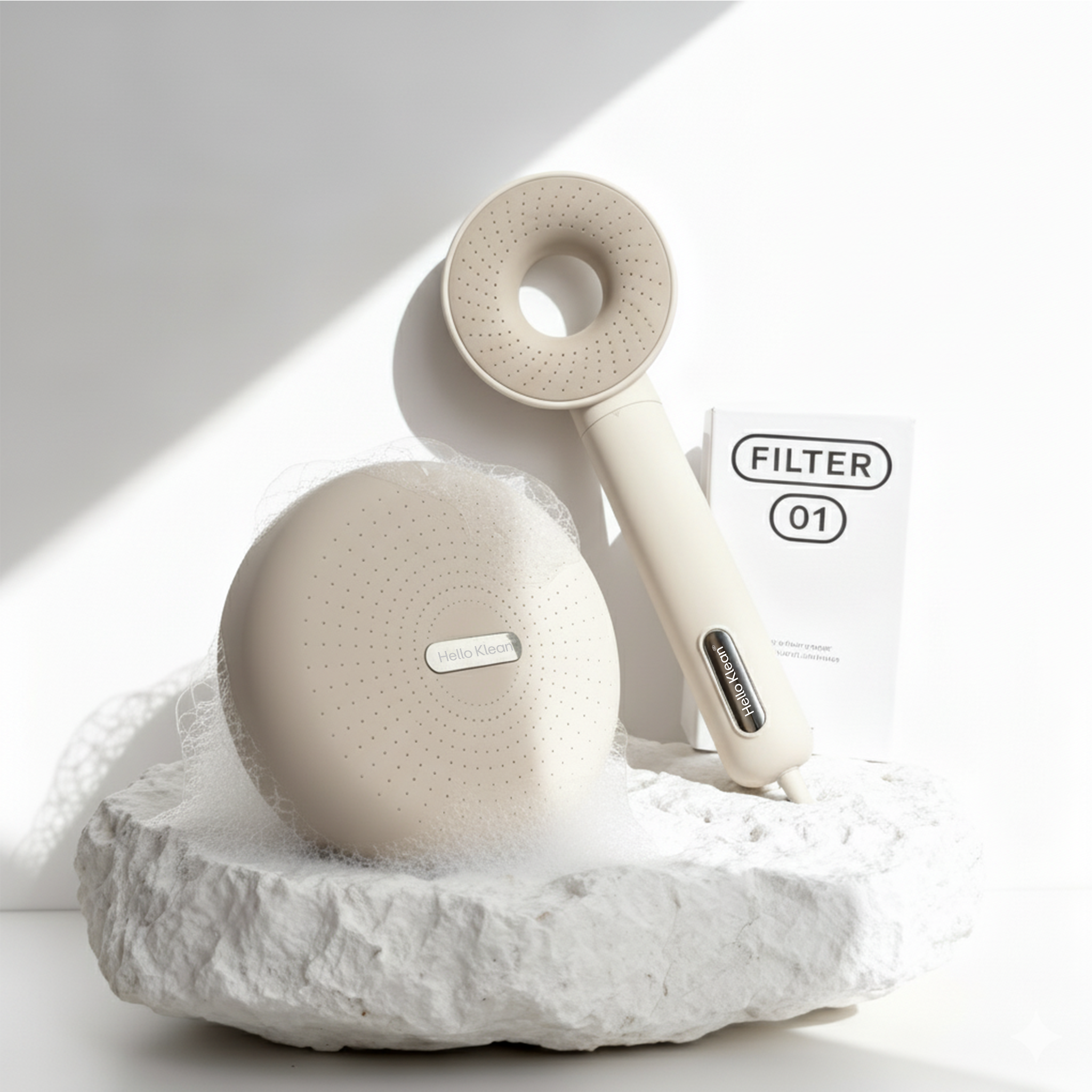
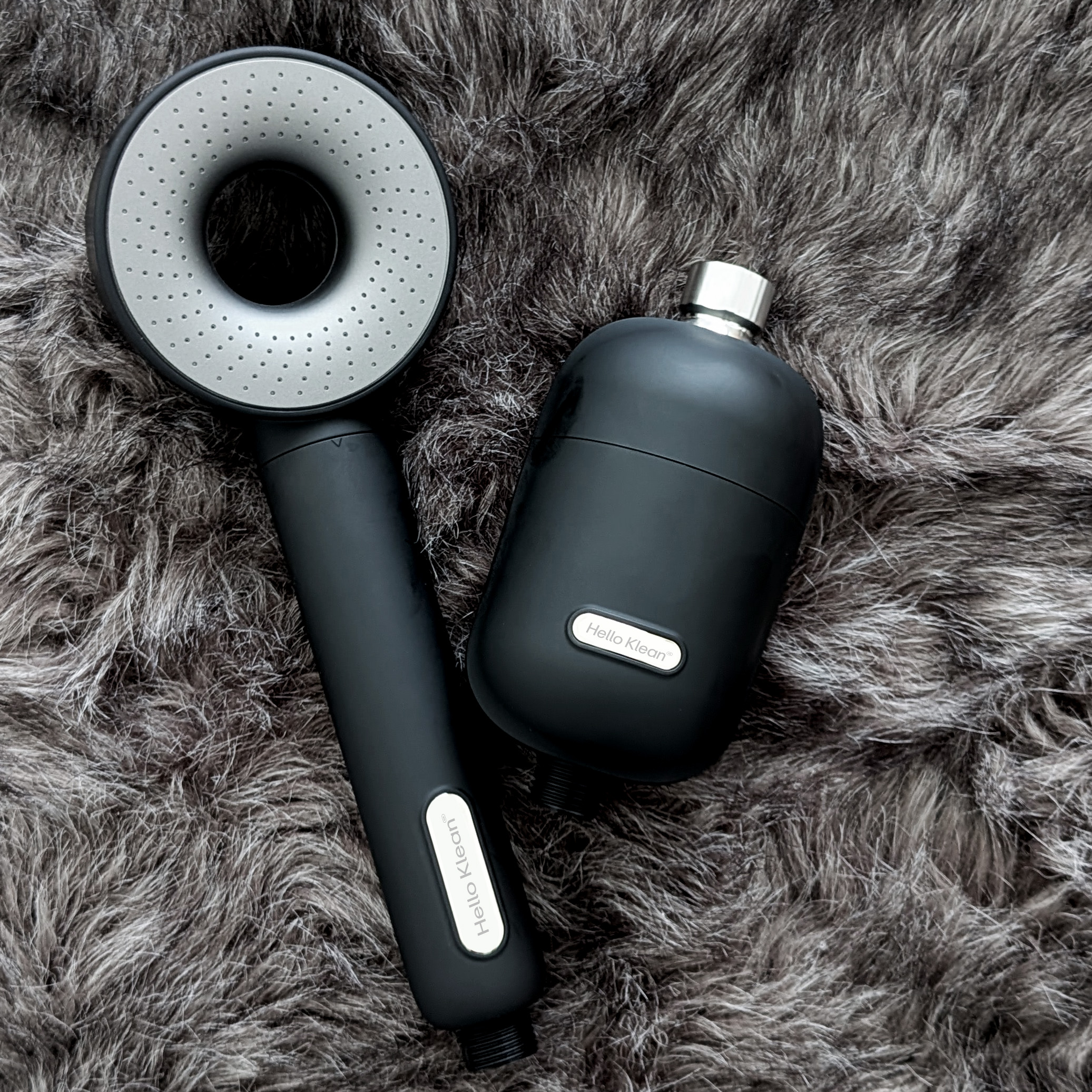
The filter capsule, the showerhead, and the rain shower were designed as a single coherent family — not three separate briefs. The same form language, the same surface logic, the same brand signature across every touch point in the shower.
CMF strategy was the unifying thread. Color was not chosen for aesthetics — it was chosen to disappear against premium bathroom chrome without looking cheap, and to reappear as an intentional object when held. Matte where you grip. Subtly reflective where the light hits. That principle applied consistently across the entire range.
Most filter brands design one hero product. A system tells a different story: it signals that HelloKlean is not selling a component — it is selling a shower ritual. That distinction changes how a brand is perceived, how it is retailed, and how it is valued by strategic partners.
Every interaction — the click of the capsule, the weight of the showerhead, the spread of the rain shower — was calibrated to feel like precision skincare technology. Not replacement parts.
"The skin-care category runs on touch before it runs on results. If someone doesn't want to hold your product, they won't trust what it does."
HelloKlean launched in a category that previously designed for concealment. Customers began photographing the system in their bathrooms and sharing it unprompted — not because the marketing asked them to, but because the objects had earned a place worth showing.
A coherent product language changes what a brand can ask for. Brita made a strategic investment. Selfridges offered shelf space. Both are signals that the system read as a brand — not a batch of components.
That is what design language does when it holds across three products instead of one: it makes the brand legible to people who weren't looking for it yet.
Product line — HelloKlean shower system, 2024